-

Taking a break – the most important step in the design process.
Taking a break – the most important step in the design process.
-

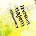
Ščurek Wines
This is a part of an assignment for a Packaging Design course I’m taking at the faculty. The idea was to take an existing packaging and redesign it in a way to make it more modern, different and fresh while trying to avoid the cliches that rule the particular product packaging. I was working on this…
-
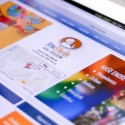
Client: Vrtec Trbovlje
This time I teamed up with Jernej from Web Studio Inframe and together we revamped an old webpage of a kindergarten from Trbovlje (Slovenija – EU). I worked on the design, and wrote the basic HTML and CSS for structure and design itself. Jernej took care of the programming and other technical things. The design was focused on…
-
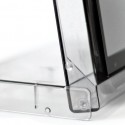
Cassette case phone stand
This is how you can make yourself a simple and effective mobile phone stand. All you need is an old audio cassette case – just flip it and put your mobile phone in. I’m sure it could be modified to hold the power adapter cord as well. But this is just a simple, no-mess, straight-to-the-point…
-

Pin my content
So, like all the cool kids I decided to get myself a Pinterest account and integrate Pinterest to my website. As a result you can see that you can now pin my articles to your Pinterest Boards. You will find the “Pin It” button at the bottom of any post next to the usual social…
-
Design for my Luxe business cards
Moo has recently issued a new business card type called Luxe. I was so overwhelmed by technical characteristics of this new cards that I decided I wanted a batch for myself. For those of you who do not know what Luxe business cards by Moo are, here is a quote from their site: [pullquote]One day,…
-
Don’t you just love it?
“Can you do this by tomorow? We’re in a real hurry.”
-
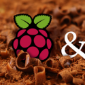
Raspberry Pi & Arduino
Recently I came across a brilliant project called Rapsberry Pi. What is Raspberry Pi you ask? Well to answer that I think it’s best that I just quote the FAQ on the Rasperry Pi’s homepage: [pullquote]The Raspberry Pi is a credit-card sized computer that plugs into your TV and a keyboard. It’s a capable little…
-

Targaryen font sampler on exhibition
My font sampler is currently on exhibition on the second floor of the Faculty of Natural Sciences and Engineering, Depatement of Textiles. There are two versions because I had to make another one that fitted the general guidelines of that Typography class where the font was made. The red one is on exhibition as well…
-
Client: Optiprint
This is a 2 meter high rollup poster I made for a printer rental company Optiprint d. o. o. based in Slovenia. Not much to say about the project. I received the data they wanted on the rollup, the logo and instructions that they want it “colorfull” since they deal in low-cost color office printing…
Got any book recommendations?